
by Allison Mills Thursday, September 4, 2014
The National Drought Mitigation Center works with federal agencies to produce a weekly map called the Drought Monitor, which displays the most recent data gathered on drought across the U.S.
One of the hardest parts of hazard mitigation is communicating risk to the public. With drought, people feel the heat while it’s happening but understanding how the current drought fits into past trends — and their implications for the future — is harder to grasp. Now, several online tools are available to help the public and decision-makers look at drought data.
The digital displays rely on historic data, often sorted by geographic region, and showcase the power of maps in effectively communicating hazard science. And with people’s expectations for slick, Google maps-style interfaces that can be viewed on a number of devices, producing maps that are intuitive and elegant — but pack in loads of data — is no easy feat. A handful of government agencies, academic programs and organizations have tried, with varying results.
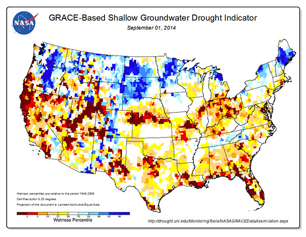
The Drought Risk Atlas, a project of the at the University of Nebraska at Lincoln, is an extensive resource for drought data. The idea of a drought atlas, which details past drought events as well as current conditions, is not new. The Army Corps of Engineers collaborated with researchers to design one in the 1990s based on weather stations within the Historical Climate Network. The old dataset was limited, however, and only based on the Palmer Drought Severity Index. The new atlas is based on multiple drought and climatological factors gathered across the U.S. and at varying spatial scales to “allow decision-makers to use this tool to better understand drought in their respective region and to make better decisions,” according to the website.
The digital map itself uses a Google interface, which is clean and easy to use, and features intuitive, simple layers as well as basic map tools like zooming and panning. You can zoom into your local region to see how your area is being affected, but the zoom extent is only useful to a regional extent before the drought zones become too generalized. The pan and zoom tools are also touchy and tend to fly off the page. A highlight of the website is not on the map, but in a separate “data” tab where users have access to historic climate data across the U.S. — although not geared toward the general public, the feature is useful for researchers and decision-makers with more extensive drought expertise.
The National Drought Mitigation Center also helps produce reports, which have been featured on the U.S. Drought Portal. The portal is part of the National Integrated Drought Information System (NIDIS) and the website includes newsletters, outlook predictions and map-based monitoring in addition to the collaborative reports with the National Drought Mitigation Center. The bottom right corner has a feature called the Local Drought Snapshot: Type in a zip code and a NIDIS drought meter with stats pops up. The sheer amount of information and resources is striking, and includes links to a number of digital tools.
Some of these links go to other websites, like the Drought Risk Atlas, but there is also a map viewer designed for NIDIS data and is part of NOAA’s climate data center. The map itself is similar to the Drought Risk Atlas, but with more map-ready data and smoother tools, including a measure tool and a transparency feature that allows for more information to be presented on the map at once. There are also several basemap options, including satellite imagery, topographic maps, street display and a basic country and state outline. The map is fairly versatile and easier for public audiences to use, but lacks the data search capabilities on the Drought Risk Atlas.
As both map viewers are designed for online interaction, they aren’t the most printer-friendly and the interface doesn’t talk to other programs like ArcGIS or Illustrator for users to incorporate into their own map production. The Data Basin website got around this issue by creating not only a map viewer, but an online map creator.
The Data Basin interface is more detailed and elaborate than either the U.S. Drought Portal or Drought Risk Atlas, partially because it doesn’t just relay drought information. Data Basin is a project of the Conservation Biology Institute and is specifically designed to enable data sharing between researchers, citizens and organizations. A number of datasets are available, many sorted into galleries by topic or region. Although it’s flexible to accommodate such a wide range of data, the interface is user-friendly with many tools available. For drought specifically, more than 400 datasets are available, along with dozens of premade maps, galleries and case studies.
Although none of these digital tools has the analytical capabilities of GIS software, many users will consider the streamlined process more enjoyable than navigating the trenches of ArcGIS. Although the maps are the most insightful features, all of these websites demonstrate the real power lies in the breadth and quality of the data. These tools simply enhance the understanding of the data for multiple audiences.
The websites can be found at: www.droughtatlas.unl.edu; www.drought.gov; www.databasin.org
© 2008-2021. All rights reserved. Any copying, redistribution or retransmission of any of the contents of this service without the expressed written permission of the American Geosciences Institute is expressly prohibited. Click here for all copyright requests.