
by Julia Rosen Sunday, June 7, 2015
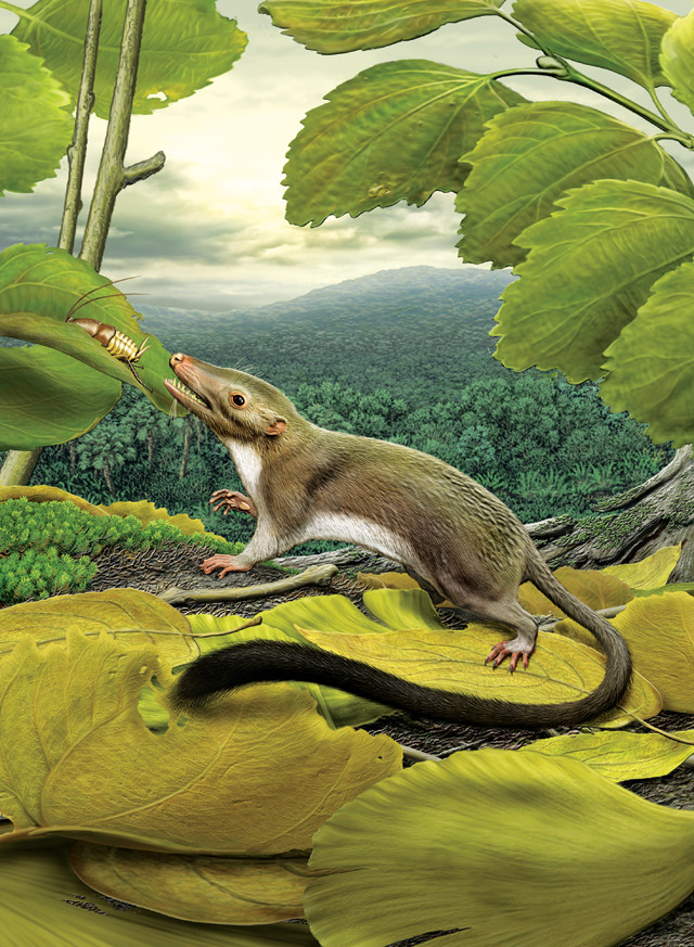
Science illustrator Carl Buell's 2012 drawing brought the oldest common ancestor of all placental mammals to life, even though no fossil record of it has been discovered. Credit: courtesy of Carl Buell via AAAS.
Perched on a ledge overlooking a lush forested valley, a creature stands on a pile of leaves, craning its neck to pluck a plump insect off a nearby branch. It looks like a rodent, maybe a sleek-looking rat or a miniature possum. It has a soft white belly and a swooping fur tail that darkens at the tip. Its ears are small, delicate and oddly reminiscent of our own, and it has exactly seven teeth on its lower jaw behind its incisor. What it does not have is a name.
That’s because scientists haven’t found so much as a rib bone, let alone an entire skeleton, from this ancient animal, which roamed Earth 65 million years ago. Everything they know about this creature — which is a lot — they inferred from studying the features of its descendants, a diverse group that includes everything from polar bears and prairie dogs to porpoises and people; this anonymous animal is the oldest common ancestor of all placental mammals.
The study that revealed its appearance, led by Maureen O’Leary of Stony Brook University, included an analysis of more than 4,500 physical traits shared by its living and extinct relatives. The results received much attention when they were published in Science in 2012, accompanied by the image described above. But the study didn’t paint that picture — a human had to translate its findings into something lifelike, accurate and aesthetically pleasing. And that person was science illustrator Carl Buell.
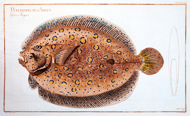
Marcus Bloch, a German physician and naturalist, created stunning fish illustrations in the late 18th century. Credit: public domain.
“The group I worked with on this worried about the size and placement of every cusp on every tooth, the texture of the hair, the placement of each and every chin and facial whisker, and the number of pads and placement of pads on the feet,” Buell said in 2012. “I drew all sorts of slightly varying versions of just about every part of the animal’s anatomy.”
This laborious process did not result from any lack of talent on Buell’s part — he’s revered among illustrators. Rather, he faced a challenging task: drawing something no one ever had seen or ever could see. In addition to making science visually appealing and easier to understand, this is what science illustrators do. They make the invisible visible.
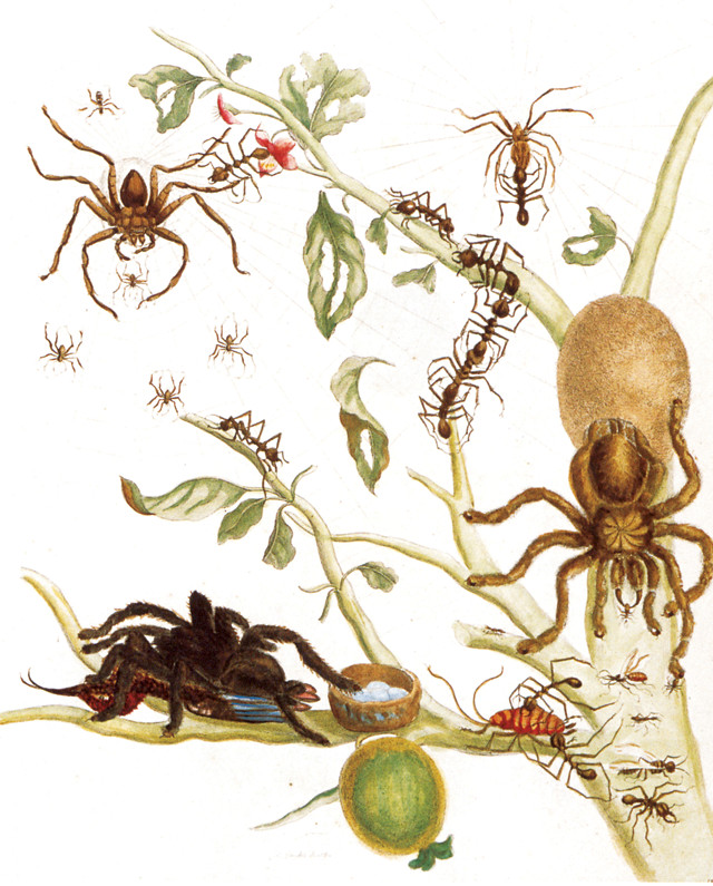
In the early 1700s, German illustrator Maria Merian documented the flora and fauna of Suriname in exquisite detail. Credit: public domain.
The history of science illustration goes back to the birth of science itself, if not before, according to Tom Baione, a librarian at the American Museum of Natural History and editor of the 2012 book “Natural Histories: Extraordinary Rare Book Selections from the American Museum of Natural History Library,” which features rare science illustrations from the museum’s collection. “The first example of science illustration … was probably on the wall of a cave,” Baione says. “Early humans were trying to describe what was around them and make sense of it.”
But the practice didn’t come into its own until the intellectual awakening of the Renaissance and the advent of the printing press. Baione cites the illustrations in “Historiae Animalium,” an encyclopedia of plants and animals compiled in the 1550s by Conrad Gessner, the Swiss naturalist and father of zoology, as some of the first examples of art intended to convey a scientific concept. Later, in 1705, came the vibrant drawings of Maria Merian, a German illustrator who moved to Suriname and documented its flora and fauna in exquisite detail. Toward the end of the 18th century, Marcus Bloch, a German physician and naturalist, created another masterpiece, a compendium of stunning fish illustrations.
In fact, possessing some degree of artistic talent — or knowing someone who did — almost seemed like a prerequisite for a scientific career in the early days. The reason was simple: The easiest way to explain what you were talking about, especially if it was exotic and unfamiliar, was to show a picture. And before the widespread availability of cameras, that meant drawing it. Once science illustrations found their way into printed books, Baione says, “then and only then was science really able to flourish and expand because those codified, standardized thoughts could be exchanged far and wide.”
Now, of course, we can capture the sights and sounds of the world around us with staggering fidelity in photographs and videos. We have also developed powerful microscopes and telescopes that stretch the boundaries of the visible world, enabling us to see things that elude the naked eye. But the expanding scope of science has outpaced even these technical achievements. As Chicago-based science illustrator Kalliopi Monoyios pointed out in a post on the art and science blog Symbiartic (entitled “Five Reasons Your Camera Won’t Steal My Job”), we now study many phenomena that are too small, too distant or too ephemeral to capture on film.
Luckily, science illustrators can venture beyond our range of vision. They can illuminate distant exoplanets, plumb the molten depths of Earth, and resurrect creatures and events long lost to time. They can even imagine scenes that have yet to happen.
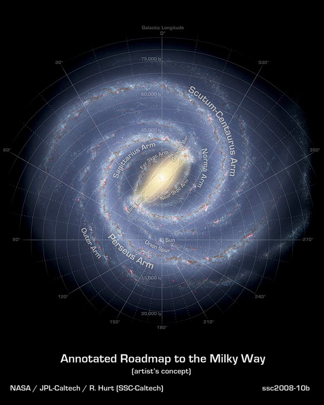
Details of science illustrator Robert Hurt's conception of the Milky Way galaxy were later found to be scientifically accurate. Credit: R. Hurt/NASA/JPL-Caltech.
When illustrators tackle subjects they can’t see, they must use their imagination to supplement the raw material they get from scientists, which varies dramatically depending on the project. Sometimes, like in Buell’s case, artists are blessed (or perhaps cursed) with heaps of data, but just as often, they make do with surprisingly little.
For a given picture, “there may be 3 percent that you actually know, and the other 97 percent you fill in with art,” says Robert Hurt, a visualization scientist for NASA’s Spitzer Space Telescope at Caltech in Pasadena, Calif.
Hurt, who trained as an astronomer, spends much of his time depicting celestial objects that we can’t actually observe directly with telescopes, like black holes, protoplanetary disks and, lately, exoplanets. The Kepler Mission telescope has spied more than a thousand of these foreign worlds, but scientists don’t actually know what exoplanets look like. That’s because astronomers mainly infer the presence of a planet by studying its host star. “What we detect is an unresolved blob of light,” Hurt says. Scientists then look for subtle changes in its brightness or movement. “Those are really the clues we get,” Hurt says.
So Hurt and his colleagues focus on what they do know. They consider the kind of star that an exoplanet orbits and the spectrum of light the star emits to decide how to color the planet’s surface and atmosphere. They note how far the planet sits from its host star and calculate whether its temperature might permit molten features, oceans or ice caps. Sometimes, they even use planetarium-grade software to show how the night sky would look from that location in the cosmos. “The science is the inference taken from those clues, and then we try to do a piece of art that will take you there,” Hurt says.
Occasionally, those artistic impulses actually turn out to be scientifically prescient. Hurt once drew an image of the Milky Way galaxy, the exact shape of which still eludes astronomers. Although his image reflected current scientific knowledge, he struggled with how to depict the outer limbs — the area of greatest scientific uncertainty. So he made artistic calls that relied on symmetry and aesthetics to complete the artwork, he says.
A few years later, Hurt got a call from Thomas Dame, an astronomer at the Harvard-Smithsonian Center for Astrophysics, who had just completed a survey of the outer galaxy that had detected a new limb. “When he overlaid [his results] on the graphic, he found that his data fit exactly where I had put the arm in the illustration,” Hurt says. “He was actually concerned I had seen some prior research that said there was an arm there.” In the end, Dame used a version of the image as a figure in his paper because, of course, he still needed a way to show something we won’t see in a photograph anytime soon: how our galaxy looks from the outside.
If exoplanets and galaxies are too far away to see, other scientific subjects suffer from problems at other extremes. Quantum physics’ principal players are much too small to capture with existing microscopes, and some geologic structures are simply too big (or too buried) to behold in their entirety. Depicting many features of our planet requires adopting an impossible vantage point: one that slices through the ground to reveal a cross-section of Earth.
Like many illustrators before her, Cynthia Shaw, an illustrator based in Washington state, took this approach when the Columbia River Exhibition of History, Science, and Technology commissioned a diagram of Pacific Northwest geology. Shaw now illustrates earth science textbooks, but at the time, she had little experience with the subject. As she dove into her research, she soon realized, “there’s no way I can explain the geology of just this area here without showing some context and showing why this happened.” To make the visible landscape understandable, she needed to show the hidden processes that shaped it.
To accomplish this, Shaw’s diagram expanded to include everything between the Juan de Fuca spreading center and the crystalline basement rocks of Idaho — a distance of about a thousand kilometers. It also plunged into the molten depths of the mantle. Her illustration captured the fundamental forces that drive Northwest geology, including the collision of two tectonic plates, the fountains of magma that rise at their boundaries, and the layers of sediment and flood basalts that peek out at the surface.
But just as importantly, the image also shows how these different geologic features and processes fit together on large spatial scales. “It’s interesting, the connections between things that you just can’t see from our limited perspective,” says Nicolle Fuller, who frequently illustrates earth science subjects for media outlets, including EARTH.
Fuller specializes in depicting systems and cycles, like carbon transfer among different reservoirs or food-web links in an African watering hole. Even though many of the elements of these systems can be seen and photographed individually, the relationships between them remain invisible. With art, she says, she can reveal them.
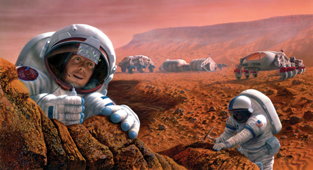
Illustrations, like this rendering of human exploration on Mars by Pat Rawlings, can provide a glimpse into the future, potentially inspiring the next generation of scientists and explorers. Credit: NASA/JSC/Pat Rawlings, SAIC.
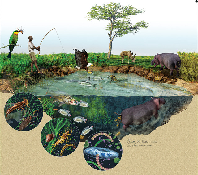
Illustrations can provide views and details that no photo can, like this cutaway cross-section by Nicolle Fuller illustrating food-web interactions in an African watering hole, including the impacts of hippopotamus defecation. Credit: ©Nicolle R. Fuller, Sayo-Art LLC.
As illustrators tackle their subjects, they must balance many competing demands — to make their work aesthetically appealing, scientifically accurate and easy to understand. But above all, they need to make it look realistic. “Whatever you are trying to create — even if it’s something you need to, in essence, make up — it has to meet the same criteria that an observable specimen does,” says Ann Caudle, director of the Science Illustration program at California State University at Monterey Bay.
This means paying attention to texture, lighting and all the qualities that our brains use to determine whether something looks believable or not. For cross-sections, Shaw says she thinks of how a rock looks at the surface and then tries to imagine “how it might look the deeper it gets and the hotter it is.” For folded sediments, like those scraped off the oceanic slab and accreted onto the continent, she employs real-world analogies: “I think of the continental crust as being just like a bulldozer,” she says.
Similarly, exoplanet illustrator Lynette Cook says she starts from pictures of our solar system, and then branches out. Cook, who has degrees in biology and art, says, “we have an idea of what the terrestrial planets look like and their diversity,” and we know about gas giants and their rings and moons. Sometimes, her strategy works well enough to fool people: After one exoplanet illustration was widely shared in a press release, she says, someone contacted her asking “‘what amazing image processing software’ I had used to refine that image. I had to say, ‘Excuse me, that’s artwork!'”
Others take a more introspective approach, like Pat Rawlings, who illustrates space hardware for clients like NASA, mostly using 3-D modeling (see sidebar). When he draws pictures of future space bases, for instance, on the moon or Mars, he immerses himself entirely in this imaginary environment. “I feel like I am in the scene,” he says.
That helps him find holes — the components scientists haven’t thought of yet. “I start looking around and going, ‘that area there is really fuzzy,’” he says. “Then I have to get up, walk out of the scene, go back and talk to people” to figure out what’s missing. His strategy makes his images look so real — so thorough and complete — that viewers sometimes tell him they find it hard to believe that these places don’t actually exist, he says.
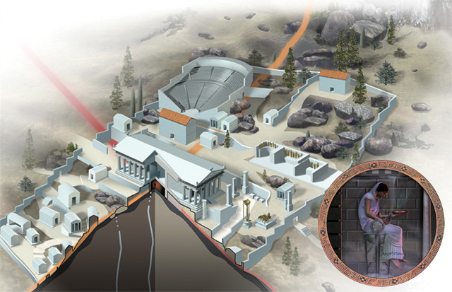
Frank Ippolito combined art and science to reveal the story behind the visions of the oracle of Delphi in Greece. Credit: Frank Ippolito.
Of course, even if we could take photos of out-of-reach phenomena — the big, the small, the distant, the extinct, the still-to-come — scientists would still need illustrators. Photographs, for all their virtues, aren’t selective. They don’t show specifically what the audience needs to see; they show everything.
“With art you can pick and choose what goes in, and you can choose what goes in based on what’s most important,” Cook says. This explains why many artists still find plenty of work drawing plants and body parts and all kinds of things that we are perfectly capable of perceiving with our own eyes. Illustrations can highlight the critical components that are easily obscured by the messy nature of reality.
For instance, illustrator Frank Ippolito once drew a diagram for the New York Times showing how a pair of intersecting faults allowed gases to rise from a buried oil reservoir to the surface. The crisscrossed faults sat directly beneath the ancient Greek Temple of Delphi, where, for more than a millennium, oracles issued prophecies based on purported visions. Scientists now think these visions were inspired by ethylene gas, which rose through the cracks and issued from a seep in the oracle’s chamber. After decades of debate, the study changed how scientists and historians thought about the temple.
“Suddenly, all of this made a lot of sense,” Ippolito says. To convey the findings, Ippolito illustrated the scene — the 3-D faults, the reconstructed ruins of Delphi, even how the oracle may have looked sitting on her stool — with a delicate balance of detail and generalization. He didn’t show the crumbling, fractured texture of the buried rock, or the crowds of anonymous Greeks milling about the temple. He showed only what the readers needed to see: the story.
© 2008-2021. All rights reserved. Any copying, redistribution or retransmission of any of the contents of this service without the expressed written permission of the American Geosciences Institute is expressly prohibited. Click here for all copyright requests.