
by Timothy Oleson Wednesday, July 6, 2016
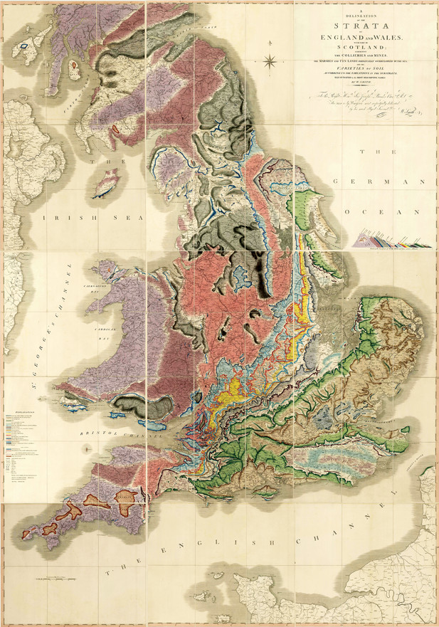
William Smith's famous geologic map of England, Wales and southern Scotland, published in 1815, featuring a labeled cross section of strata at middle right. The original map measured 2.6 meters by 1.8 meters and was assembled from 15 sections. Credit: courtesy of the Geological Society of London.
Last year marked the 200th anniversary of the publication of what many consider the greatest geologic image ever produced: William Smith’s epic map, entitled “A Delineation of the Strata of England and Wales with Part of Scotland.” In striking color, scale and detail, the 1815 map laid bare the region’s bedrock — from tilted layers of slate and fossil-rich marls and sandstones to Carboniferous coal seams and granite plugs — as none had before. The bicentennial of the map’s publication was commemorated in several sessions and displays at the annual meeting of the Geological Society of America (GSA) in Baltimore last October.
Although it is perhaps the single-most recognized depiction within geology, and its extraordinary influence is hard to dispute, it is but one of many historically transformative images in a field that relies heavily on illustration and visualization to help convey information and shape our understanding of the natural world. Some of these other illustrations were celebrated in another session at GSA last fall, aptly titled “The Great Images in Geology.”
What makes for a great image is fairly subjective, of course. Often, they’re illustrations that synthesize large amounts of data into forms that are far more digestible and comprehensible than the thousands of words it might otherwise take to explain the observations. Or they are images that introduce the utility of novel techniques, or that distill and reframe complex and provocative theories in new ways.
Sometimes, the images — along with the theories they represent — engender skepticism initially, and yet ultimately prove persuasive for many people, stimulating sea changes in scientific consensus. “Great illustrations commonly are ones that allow [for] … those ‘aha!’ moments,” says Joanne Bourgeois, a sedimentologist at the University of Washington who co-chaired the “Great Images” session at GSA with Renee Clary, a geologist at Mississippi State University and director of the university’s Dunn-Seiler Museum. And beyond these images’ scientific significance, Bourgeois says, “a lot of them are great art.”
Geologic images record the current scientific thinking of a particular time and have thus documented the development of the science, Clary notes. Although these figures’ influence has long since been engrained in the field, continuing to study and appreciate them is important, particularly for students, Bourgeois and Clary say. Such figures also offer an “entrée into history” and a way for people to “learn that science changes through time … so that they are better critical readers of what we think we know today,” Bourgeois says.
With that in mind, here are a few images that served as turning points in earth science.
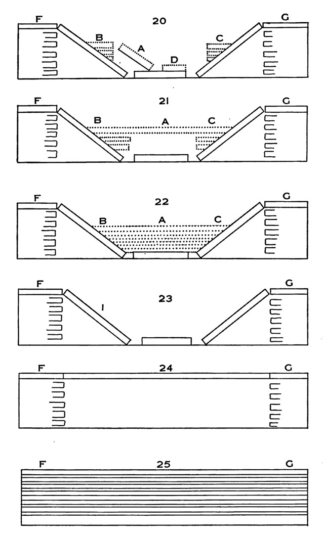
Nicolaus Steno's stratigraphic diagram from 1669, based on observations he made while in Tuscany, offers an example — in reverse order — of how a landscape can change as strata are eroded and new layers are deposited. The diagram illustrates the core stratigraphic principles of original horizontality and superposition. Credit: Steno, "De Solido Intra Solidum Naturaliter Contento Dissertationis Prodromus," 1669.
In the 17th century, geology was still in its protracted infancy. From antiquity, philosophers and scholars had observed rock layers and fossils, but understanding of how they’d come to be was still largely rooted in Biblical or cosmogonic explanations, at least in Renaissance Europe. Sedimentary strata and other rocks were presumably formed during Noah’s Flood — or during great floods attributed to extraterrestrial causes — and unchanged since. A few natural historians, including Leonardo da Vinci, had posited that some fossils came from once-living animals, but the biological origins of most fossils were not widely known or accepted, nor were the processes by which they could become embedded in solid rock.
It would take another century — with the 18th-century efforts of geologists like Giovanni Arduino in Italy, James Hutton in Scotland, Johann Gottlob Lehmann in Germany, and many others — before Earth’s ancient age and the actual process by which rocks form began to be more widely appreciated. But, in 1669, Danish scientist Nicolaus Steno laid the foundation upon which later scientists would build with his work, “De Solido Intra Solidum Naturaliter Contento Dissertationis Prodromus," or “Preliminary Dissertation Concerning a Solid Body Naturally Contained Within a Solid” (“Prodromus” for short). Steno’s training was in anatomy, and he won early notoriety for his studies of glands, muscle structure and blood vessels. But his chance dissection of a shark’s head — the teeth of which resembled so-called glossopetrae, or “tongue stones,” found encased in rock — spurred an interest in fossils and rock strata.
Steno’s “Prodromus” was “a slim volume — all of seventy-eight pages, with just a handful of simple diagrams — in which he laid down [geology’s] blueprint: the science of the earth’s geologic history, of deep time,” wrote Alan Cutler in his 2003 biography of Steno, “The Seashell on the Mountaintop." One of these diagrams comprised six sequential figures, each based on locales Steno had observed during his tenure in Tuscany under the patronage of Grand Duke Ferdinando II and depicting rock strata disturbed to various extents. Steno, a devout converted Catholic and later bishop, described how successive layers of rock could have formed from water-deposited sediment, thus implying that different layers were deposited at different times in the past while not explicitly refuting their purported origins in one or more Biblical deluges. As portions of strata eroded away “by the force of fires or waters,” other portions could collapse down to form valleys where new layers could be deposited.
The diagram illustrated, for the first time, the core stratigraphic principles of original horizontality and superposition: that sedimentary strata are, respectively, deposited initially as flat layers and that higher layers in a succession are necessarily younger than lower layers. The diagram also acknowledged that landscapes could transform over time due to natural forces. Even if Steno did not fully grasp how, and over how long, such change might occur, his “dynamic way of looking into Earth layers [was] absolutely original,” says Troels Kardel, a retired physician in Denmark who has studied Steno for more than 40 years.
Steno’s ideas about rock strata — as well as many of his ideas about fossils and anatomy — amounted to conjectures based on processes that were not observable due to the long timescales over which they worked or because of technological shortcomings, Kardel says. As most science of Steno’s day was concerned with explaining nature based on directly observable phenomena, many of his hypotheses, though treated seriously by his peers, Kardel notes, were rejected at the time.
Today, popular news stories about research into past life on Earth — be it early mammals, marine reptiles or dinosaurs — often include illustrations of what scientists think the ancient animals and their environments looked like. These illustrations share a tremendous amount of information and, at the same time, stoke our interest and imagination in ways that descriptions in text often can’t; the same goes for museum exhibits and movies.
Such representations of past ecosystems, Clary says, owe their heritage to an 1830 watercolor titled “Duria Antiquior," or “A More Ancient Dorset,” by English geologist Henry De la Beche. A “gentleman geologist” who was influential in the professionalization of the science, De la Beche was an active member of the Geological Society of London and the Royal Society, and, in 1835, became the first director of what would later become the British Geological Survey. His interest in geology emerged in part from his time growing up near the fossil-rich sea cliffs of Lyme Regis in Dorset, where he knew famed fossil purveyor Mary Anning, who excavated some of the first remains of ichthyosaurs, plesiosaurs and other ancient animals.
De la Beche — a gifted artist who illustrated his own books to improve sales — painted “Duria Antiquior” in 1830 to raise funds for his friend Anning. The watercolor — which was subsequently converted to a lithograph for reproduction and sale — shows an imagined scene along the palm-lined coast of Dorset, England, in the Jurassic, the water, sky and shoreline busy with ichthyosaurs, plesiosaurs, pterosaurs, ammonites, turtles, fish and other animals. There are also skeletal remains on the seafloor waiting to become fossils, and even — in a seemingly humorous nod to contemporary geologic interest in fossilized scat, Clary notes — the stuff of future coprolites falling from a frightened plesiosaur being attacked by an ichthyosaur.
French zoologist Georges Cuvier, in his notebooks, is known to have sketched lifelike renderings of ancient animals based on fossils. But “Duria Antiquior” is “the first published scene of deep time — essentially putting flesh on animals, putting them in an ecosystem, and reconstructing animal life” as De la Beche thought it might have happened, Clary says. There are a few mistakes, including wing-like features added to the living ammonites in the image, she says, but overall the watercolor and lithograph (which varies slightly from the original) offer a “remarkable” recreation of Dorset in the Jurassic. It also features the first-known use in print of the “aquarium view,” where the viewer looks through the water, “a perspective that wasn’t readily available until the advent of the Victorian parlor aquarium decades later,” Clary says.
e la Beche’s image did not spur a “sudden craze to put flesh on these [extinct] animals” or reconstruct other ancient ecosystems in illustrations, which would have to wait until the North American dash to dig up dinosaurs later in the century, Clary says. But its lasting legacy is abundantly clear today, she notes, making “Duria Antiquior” perhaps the most important image of geology’s early-19th-century “golden age.”
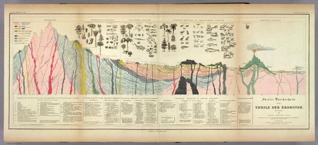
This German reproduction of the figure William Buckland included in his Bridgewater Treatise was published in 1841 in Heinrich Berghaus' "Physikalischer Atlas." In this version of the figure, Berghaus added annotations below the cross section about the geology and organisms depicted; Buckland had not included these annotations with the figure, but had instead described the figure in detail in the text of his book. Credit: courtesy of the David Rumsey Map Collection.
Several years after “Duria Antiquior,” one image that did include sketches of fully reconstructed animals — in this case to help illustrate Earth’s history over a long time rather than in a single snapshot — appeared in the sixth of the Bridgewater Treatises, a series commissioned by the Earl of Bridgewater to address contemporary scientific debates with discussions rooted in natural theology. The sixth treatise, published in 1836 and entitled “Geology and Mineralogy Considered With Reference to Natural Theology," was written by William Buckland, an English theologian and geologist known largely for his attempts, and then subsequent rejection of efforts, to reconcile the Biblical account of creation with emerging evidence that Earth was far older than believed.
The two-volume work was a massive compendium chronicling “the history of life on the planet based on the fossils that had been found up to that point,” Bourgeois says. Buckland’s ambitious effort included hundreds of illustrations of fossil plants and animals, many drawn by his wife, Mary Buckland. The most notable figure, however, was a large, hand-colored, fold-out diagram combining an idealized cross section of European geology — originally used by Scottish geologist Thomas Webster — with 120 sketches of extinct plants and animals. Accompanied by a 17-page description, the diagram shows, among many other features, a mountain of granite flanked by metamorphosed rocks, all cross-cut by a variety of veins and dikes; stacked sedimentary sequences, tilted and folded in places; and active terrestrial and oceanic volcanoes fed by underlying magma conduits, along with basalt outcrops at the surface. Above the geology sit the reconstructed species, grouped together by their occurrence in the stratigraphic record — and thus in geologic time.
“While cross sections had been published together with maps, and plates of fossils published to accompany stratigraphic sections, the synoptic view presented by Buckland and Webster was a tour-de-force illustrating all of geologic time as set out by rocks and fossils,” Bourgeois wrote in the abstract to her GSA talk about the diagram. In addition to demonstrating a progression in the geology, from older, more deformed rocks to younger, less deformed ones, Bourgeois says, “the most important thing is that it shows a progression of life.”
It was more than 20 years before Darwin would publish his landmark “On the Origin of Species," but ongoing debates in the 1830s questioned whether life was somehow progressive, perhaps through transmutation or other means, Bourgeois says. Although Buckland wasn’t trying to settle the debate in the treatise, and he wouldn’t have accepted transmutation, she says, it’s clear from the diagram and his descriptions that profound changes had occurred in life on Earth.
“Whether that diagram actually changed people’s minds versus just instructing them is still open to question,” Bourgeois says. From historical research, however, it’s known that the book was popular in its day — a best-seller, in fact, that was frequently checked out of libraries — so a lot of people, including Darwin, would likely have seen the diagram.
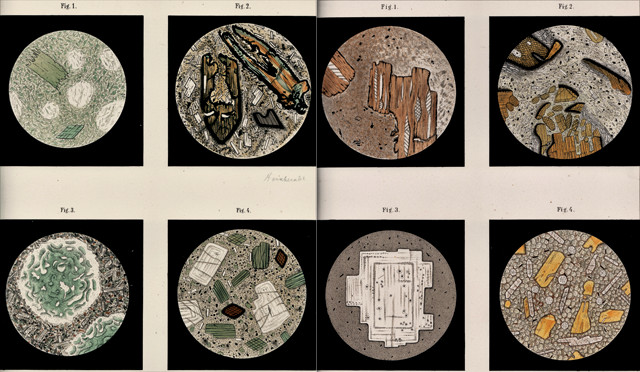
Representative figures from Ferdinand Zirkel's 1876 work, "Microscopical Petrography," show the accuracy and detail Zirkel achieved in his hand-drawn and hand-colored illustrations of thin sections of rocks collected during the U.S. 40th Parallel Survey. Zirkel identified the sample shown in Figure 4 (bottom row, second from left), which features zoned plagioclase crystals (white) and green and brown hornblende amid a greenish groundmass, as a propylite from near Tuscarora, Nev. The nature of propylite was controversial at the time. Thought by some to be a product of primitive magmas that evolved to sequentially erupt andesites, trachytes, rhyolites and basalts, propylite was later determined to be an altered form of andesite. Credit: Zirkel, "Microscopical Petrography," Vol. 6 in the Report of the Geological Exploration of the Fortieth Parallel, U.S. Army, 1876.
In the mid-19th century, as geologists continued to rely mostly on fieldwork, fossils and hand samples, microscopic petrography — the study of thin sections of rock under the microscope — began emerging as a powerful new technique. Following the pioneering work of English microscopist Henry Clifton Sorby, German geologist Ferdinand Zirkel was largely responsible for displaying the method’s merits, particularly with the thorough descriptions and beautifully detailed illustrations in his 1876 work, “Microscopical Petrography."
The volume was the sixth installment of a report detailing the findings of the U.S. “Geological Exploration of the Fortieth Parallel” (also known as the “40th Parallel Survey”) conducted from 1867 to 1872. Led by Clarence King, the U.S. geologist at the time, the survey mapped about 160,000 square kilometers across Colorado, Nevada, Utah and Wyoming; the team also collected observations of extant birds and plants, as well as fossils, along with thousands of rock samples. After completing the fieldwork for the survey, King, who’d heard of Zirkel and his petrographic work in Europe, enlisted the German scientist to come to the U.S. to study the samples, many of which had been taken from Cenozoic-aged volcanic rocks spread across the American West.
These rocks “were of major interest because the scale of volcanism in that part of the world in the Cenozoic Era was incredible … And people were interested in how to classify volcanic rocks,” says Ken Aalto, a geologist at Humboldt State University in California. Zirkel’s finished work included nearly 300 pages of descriptions of the samples King provided as well as 12 plates of hand-drawn and hand-colored illustrations of representative thin sections. The drawings are “incredibly accurate to what one would find if one cut a modern thin section of rocks from the survey area,” Aalto says, showing mineral fabrics, grain sizes and a diversity of features in greater detail than Zirkel had achieved in prior studies. The volume “was the first publication of what we now call photomicrographs — only of course there was no photo,” Aalto notes, and it introduced the technique to North America.
Working with King to explain the geologic origins of his microscopic observations, Zirkel did err in some of his interpretations: Notably, he sided with the German geographer Ferdinand von Richthofen’s scheme that different Cenozoic volcanic rocks evolved sequentially from a common type of parent magma. Von Richthofen’s hypothesis was later shown to be incorrect, but the impact of Zirkel’s volume was great nonetheless, Aalto says. Within 10 or 15 years, he says, microscopic studies “became a major emphasis of the U.S. Geological Survey (USGS),” which was founded with King as the first director in 1879. “If you look up the published literature post-Zirkel in the U.S., you begin seeing these types of microscopic illustrations in all of the USGS reports.”
As researchers adopted the technique, there were rapid advances in the understanding of the complex family of feldspar minerals, for example, Aalto notes. And ultimately, microscopic petrography offered “a new way to understand the evolution of igneous rocks, especially … the classification, the interpretation of how they developed, and what the source was for the rock material. So it was a tremendous breakthrough.”
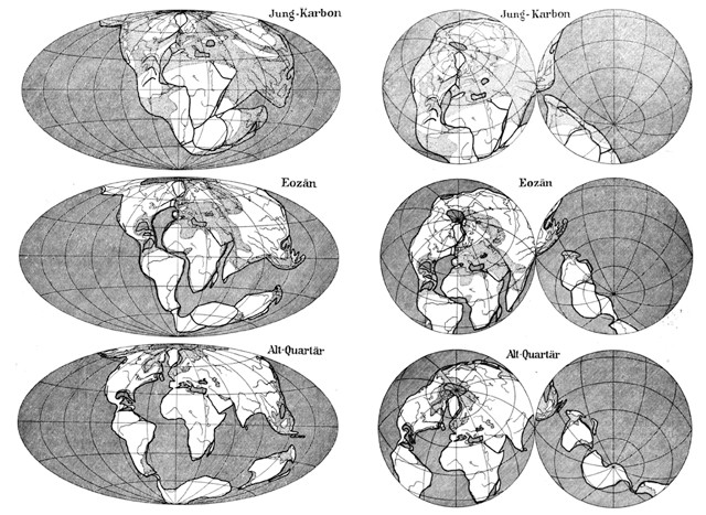
Beginning with the third edition of his book, "The Origin of Continents and Oceans," published in 1922, Alfred Wegener included equal-area projections of Earth to better illustrate how continental drift works on a spherical planet. The Hammer (left) and Lambert (right) projections show Wegener's reconstructions of the continents in the Upper Carboniferous (Jung-Karbon), the Eocene (Eozän) and the Lower Quarternary (Alt-Quartär). Credit: Wegener, "Die Entstehung der Kontinente und Ozeane," 4th ed., Friedr. Vieweg & Sohn Akt.-Ges., 1929.
By the late 1800s, geoscientists had noted the occurrence of seemingly related fossil distributions and geologic terranes in distant locales — on either side of the Atlantic in South America and Africa, for example. Theories to explain these peculiarities proposed that now-submerged land bridges might have previously connected the regions across the oceans, or that portions of massive continents could have collapsed to form the ocean basins that now separate formerly conjoined areas.
German geophysicist Alfred Wegener didn’t buy either of those ideas, and in 1912 he published the first edition of “The Origin of Continents and Oceans," which laid out the competing theory of continental drift. While Wegener and some paleoclimatologists argued that only continental drift, which suggested that the continents moved over Earth’s surface through time, could explain all of the available data — including, for example, that tropical plant fossils could be found in Greenland — the book met with heavy resistance from most geologists and geophysicists.
Undaunted, Wegener refined his arguments in subsequent editions of the book. What he realized from reading criticism of the book is that his detractors “didn’t understand how Earth works on a spherical surface,” says Mott Greene, a historian of earth science at the University of Washington who published a biography of Wegener in 2015. Wegener trained initially as an astronomer, so “in his mind, Earth is always a spherical object,” Greene says, but this was not the case for most geologists, who were accustomed to investigating relatively small areas over which Earth’s curvature has insignificant effects on physical processes. When these scientists tried to make sense of Wegener’s ideas using the common Mercator map of the world — which vastly distorts the apparent size of the polar regions — it was difficult for them to see how the continents could have fit together.
For the book’s third edition in 1922, Wegener created global maps using alternative projections — the Hammer and Lambert oblique orthographic projections — that offered more realistic portrayals of Earth’s round surface. In each projection, he depicted the configuration of the continents during the Upper Carboniferous, when most landmasses were joined as a supercontinent, the Eocene and the Lower Quaternary, according to the predictions of continental drift theory. In this edition, “he started, right at the very beginning of the book, with those maps,” Greene notes. “This made the point that Earth is a sphere, and if you look at [the continents] on a spherical surface, this is how you’re going to make sense of the theory.”
Although Wegener’s physical explanation for how the continents moved proved incorrect — he thought they plowed through oceanic crust like icebergs through water — they did basically move “in the way that he thought they moved,” Greene says. It would still take several decades before the true mechanism was revealed and geologic consensus sided with Wegener, but “for the people who were persuaded, it was those images that persuaded them,” Greene says.
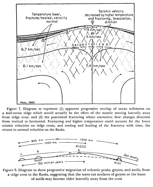
Figure 7 (left), with its original caption, from Harry Hess's 1962 paper illustrates his conception of seafloor spreading: hot mantle material rising toward mid-ocean ridges to form new ocean crust, the symmetric movement of this crust away from the ridge axis, and sediment layers on the ocean bottom that grow thicker with distance from the ridge. Figure 9 (above) further depicts how seafloor spreading could explain the formation of flat-topped seamounts called guyots. Credit: both: Hess, "History of Ocean Basins," in Petrologic Studies: A Volume in Honor of A.F. Buddington, Geological Society of America, 1962.
When plate tectonic theory emerged in the 1960s, Wegener’s fundamental notion that the continents had moved and continue to move around the planet was finally vindicated. Leading up to this time, there was growing evidence that one or more large-scale but as yet unknown dynamic processes were operating on Earth. Early bathymetry showed varying but fairly predictable changes in seafloor depth from shallow mid-ocean ridges to deep trenches near continental margins. Relatively thin layers of sediment and the youth of the oldest fossils on the seafloor, meanwhile, seemed at odds with the planet’s ancient age. Indications of polar wander and magnetic reversals suggested that continents might have changed orientation through time. And some researchers, like Australian geologist S.W. Carey, had updated Wegener’s proposed positions for the ancient continents, finding even better fits.
Still, in the late 1950s, “the reigning paradigm … was fixed continents and old ocean basins and so forth,” says Eldridge Moores, a geologist and professor emeritus at the University of California at Davis. But at a 1959 guest lecture by Carey at Princeton University, Harry Hess, a professor at Princeton, “seemed to have a flash of insight,” recalls Moores, who was a graduate student at Princeton at the time. Within weeks, Moores says, Hess’s thoughts had jelled into an early draft of what would become his seminal 1962 paper, “History of Ocean Basins," which hypothesized the process of seafloor spreading.
The paper, published by GSA in a volume dedicated to Hess’s former advisor, Arthur Buddington, has a dozen figures, including several schematics that illustrate elements of how continents moved and ocean basins grew through mid-ocean ridge volcanism. Figure 7 offers an overall summary of the process, illustrating the rise of hot mantle material toward ridges, where it reacts with seawater to form serpentinite and then fractures as it cools and solidifies into ocean crust — processes that, in agreement with observations, attenuate the velocity of seismic waves traveling through the ridges. The figure also illustrates the symmetric movement of new crust away from the ridge axis, and how sediment layers at the ocean bottom become thicker with distance from the ridge. Figure 9 in the paper further illustrates how seafloor spreading could explain the formation of peculiar flat-topped seamounts called guyots, which Hess had studied since the 1940s.
Although there was continued opposition to seafloor spreading in some quarters, “a number of [scientists] bought it almost immediately,” Moores says. “This is a good example of a Thomas Kuhn-like scientific revolution,” he says, when “somebody comes along and has a bright idea that has greater explanatory power [than the prevailing paradigm], and after a certain amount of shuffling and opposition and reluctance, people come around to the new paradigm.” There are, to be sure, many other great images that propelled plate tectonics. As examples, Moores cites the symmetric magnetic reversals around mid-ocean ridges — first noted by Fred Vine and Drummond Matthews in 1963 and then illustrated by Vine in 1966 with the now-famous zebra-stripe pattern — and the map showing earthquake foci concentrated on plate boundaries published by Bryan Isacks, Jack Oliver and Lynn Sykes in 1968. But it was Hess’s 1962 diagrams illustrating seafloor spreading that triggered the revolution.
© 2008-2021. All rights reserved. Any copying, redistribution or retransmission of any of the contents of this service without the expressed written permission of the American Geosciences Institute is expressly prohibited. Click here for all copyright requests.