
by Allison Mills Tuesday, May 26, 2015
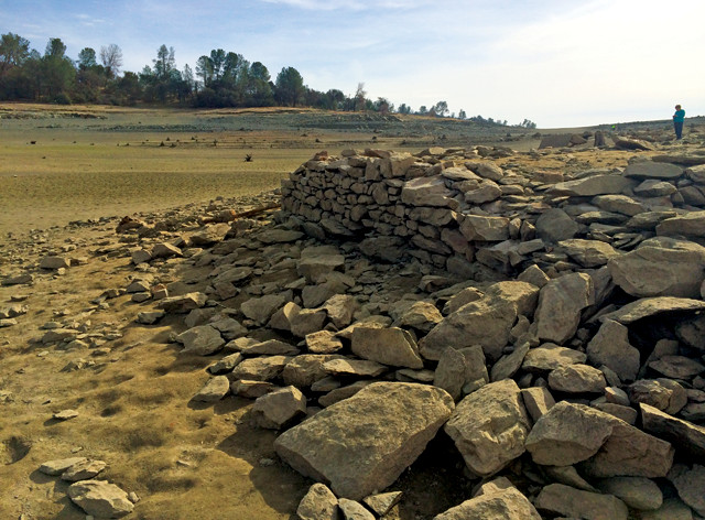
California's current drought has been one of the worst since record-keeping began. Credit: Megan Sever.
With drought, people feel the heat while it’s happening, but understanding how current droughts fit into past trends — and what they mean for the future — is harder to grasp. Several online tools are available to help the public and decision-makers make sense of drought data. Viewers can see current and historical droughts superimposed on maps, focusing in on specific locations or broadening the view to larger regional, national or global droughts.
The Drought Risk Atlas, a project of the National Drought Mitigation Center (NDMC) at the University of Nebraska at Lincoln, is a rich resource for drought data. To go beyond dry tables of numbers, a drought atlas details the spatial extent and severity of past drought events as well as current conditions. The idea is not new. The U.S. Army Corps of Engineers collaborated with researchers to design an atlas in the 1990s based on weather stations within the Historical Climatology Network. The old data sets were limited, however, and based on a single indicator, the Palmer Drought Severity Index, which is not effective for measuring drought in irrigated cropland. The new atlas displays multiple drought indices and includes climatological factors gathered across the U.S. and at varying spatial scales to “allow decision-makers to use this tool to better understand drought in their respective regions and to make better decisions,” according to the website.
The digital map itself uses a Google interface, which is clean and easy to use, and features intuitive, simple layers as well as basic map tools like zooming and panning. The zoom feature is only useful down to the regional scale, as the drought zones are too generalized at finer scales. The pan and zoom tools are also touchy and may send you flying off the map. In addition to the map, however, there is a separate “data” tab where users have access to historical climate data from across the U.S. Although not geared toward the public, the feature is useful for researchers and decision-makers with more extensive drought expertise.
The NDMC also helps produce reports, which are featured on the U.S. Drought Portal. The portal is part of the National Integrated Drought Information System (NIDIS), and the website includes newsletters, outlook predictions and map-based monitoring, updated at least weekly. A clever feature available on the main page is the “Drought in Your Backyard” widget: Type in a zip code and an NIDIS drought meter with stats pops up. The sheer amount of information and resources is striking, and includes links to a number of additional digital tools.
Some of these links go to other websites, like the Drought Risk Atlas, but there is also a map viewer designed to display NOAA’s Climate Data Center, which allows users to explore NIDIS data. The map itself is similar to the Drought Risk Atlas, but with more map-ready data and smoother tools, including a distance measuring tool and a transparency feature that allows for more information to be presented on the map at once. There are also several basemap options, including satellite imagery, topographic maps, street display and a basic country and state outline. The map’s interface is easy for public audiences to use, but lacks the multiple data sets presented through the Drought Risk Atlas.
As both map viewers are designed for online interaction, they aren’t very printer-friendly. The interfaces also aren’t compatible with other programs like ArcGIS or Illustrator, complicating the process for users who might want to incorporate outputs into their own map productions.
The publicly available Data Basin website, designed to enable easy data analysis and visualization, got around this issue by creating not only a map viewer, but also an online map creator.
The Data Basin interface is more detailed and elaborate than either the U.S. Drought Portal or Drought Risk Atlas, partially because it doesn’t just relay drought information. A project of the Conservation Biology Institute, Data Basin is specifically designed to enable data sharing between researchers, citizens and organizations. A number of data sets are available, many sorted into galleries by topic or region. Data Basin can accommodate a wide range of data, and the interface is surprisingly user-friendly, with many tools available. In terms of drought specifically, more than 400 data sets are available, along with dozens of preloaded maps, galleries and case studies.
Although none of these digital tools has the analytical capabilities of GIS software, many users will consider the streamlined process more enjoyable than navigating the trenches of ArcGIS. And although the maps are their most insightful and engaging features, each of these websites demonstrates that their value comes from the breadth and quality of the data that go into the cartography. These maps simply enhance the accessibility of the data for multiple audiences.
The websites can be found at: http://droughtatlas.unl.edu, www.drought.gov and www.databasin.org.
© 2008-2021. All rights reserved. Any copying, redistribution or retransmission of any of the contents of this service without the expressed written permission of the American Geosciences Institute is expressly prohibited. Click here for all copyright requests.