
by Seth Stein, Edward Brooks, Bruce Spencer, Kris Vanneste, Thierry Camelbeeck and Bart Vleminckx Tuesday, February 7, 2017
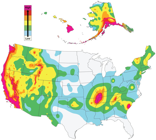
The U.S. Geological Survey's 2014 earthquake hazards map indicates the hazard of shaking from earthquakes occurring during the next 50 years. Seismologists are trying to understand and improve how well earthquake hazard maps work. Credit: USGS.
Imagine waking up to a cloudy day. The weather forecast predicts rain. Before canceling your hiking plans, it’s worth considering how accurate the forecast has been before. If it’s been right most of the time, canceling your plans makes sense. If it’s often been wrong, you might chance it and go hiking. How you use the forecast depends on how much confidence you have in it, which mostly depends on how accurate it has been to date.
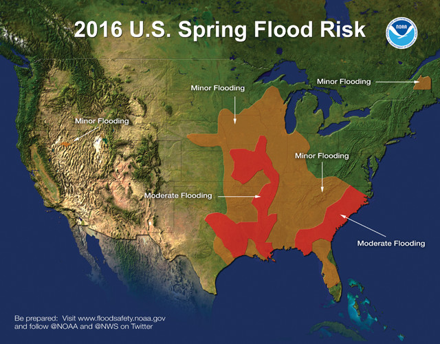
Seismologists can gain insights about earthquake hazard maps from other forecasting applications, like weather forecasting. Forecasts, like this spring flood risk forecast map, start with building a conceptual model of the process in question, then implementing it on a computer to produce a forecast and comparing the forecast to what actually happens. Credit: NOAA.
Seismologists now face a similar issue in forecasting earthquake hazards. For about 40 years, they have produced brightly colored probabilistic earthquake hazard maps. Such maps are often used to prepare for earthquakes, notably in developing codes for earthquake-resistant construction. These are not earthquake predictions, but hazard forecasts — an important distinction, because predicting exactly where and when earthquakes will happen is impossible, at least at present. Probabilistic hazard maps use scientifically based statistical estimates of the probability of future earthquakes and the resulting shaking to predict the maximum shaking that should occur with a certain probability within a certain period of time. Larger levels of maximum shaking correspond to higher predicted hazards.
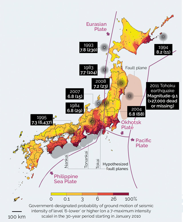
Figure 1: Comparison of Japanese national hazard map to the locations of earthquakes since 1979 that caused 10 or more fatalities. All of these quakes, including the magnitude-9.1 Tohoku quake, occurred in areas designated as low-hazard zones. Credit: Geller, Robert J., Nature, 2011, reprinted with permission from Macmillan Publishers Ltd.
However, hazard maps are far from perfect, as revealed by the March 2011 magnitude-9.1 Tohoku earthquake, which forced seismologists and earthquake engineers to face the fact that highly destructive earthquakes often occur in areas that hazard maps predict to be relatively safe. Every few years, the Japanese government produces a national seismic hazard map like that in figure 1. But since 1979, all earthquakes that have caused 10 or more fatalities in that country have occurred in places the map designated as low hazard — Tohoku being one of them. Similar discrepancies between expected and actual shaking have occurred during other quakes, including the 2008 magnitude-7.9 event in Wenchuan, China, and 2010 magnitude-7.1 event in Haiti. In other places, such as the central U.S.’s New Madrid Seismic Zone, hazard maps likely overestimate the hazard.
Surprisingly, although earthquake hazard maps are used worldwide, and affect millions of people and billions of dollars’ worth of infrastructure, seismologists know little about how well the maps actually predict the shaking that occurs or why problems with the maps arise. It could be that some aspects of hazard mapping methods are deficient. Alternatively, maybe the methods are fine but the specific inputs used for individual maps are sometimes wrong. A third possibility is bad luck — the maps offer forecasts in terms of probabilities, and unlikely things sometimes happen. As a result, we don’t know how good or bad the maps are or how much confidence users should have in them. Fortunately, this situation is starting to change.
Mura, Japan, 11 days after the Tohoku quake and subsequent tsunami devastated the area. Hazard maps provide a service, helping regions erect buildings to withstand the strongest shaking expected in an area — but they have to be accurate to provide that service. Credit: U.S. Navy photo by Mass Communication.
Because earthquake hazard maps offer forecasts, we can gain insights about them from other forecasting applications, like weather forecasting or evaluating a baseball player’s performance.
Forecasts start with building a conceptual model of the process in question, implementing it on a computer to produce a forecast, and then comparing the forecast to what actually happens. Weather forecasts are based on models of the atmosphere evolving over time, just as earthquake hazard maps are based on models of how faults behave over time.
Assessing how well this process works involves verification and validation. Verification asks how well the algorithm used by the computer program to produce the forecast implements the conceptual model: Have we built the model right? Validation asks how well the model forecasts what actually occurs: Have we built the right model?
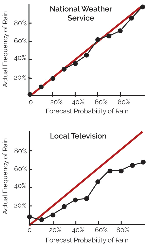
Figure 2: Comparison of the predicted probability of rain to the fraction of the time it actually rained, for National Weather Service and a local television station's forecasts. Credit: Stein et al., Bulletin of the Seismological Society of America, 2015, after a figure in "The Signal and the Noise" by Nate Silver.
Weather forecasts are routinely evaluated — validated — to assess how well their predictions matched what actually occurred. A key part of this assessment is adopting agreed metrics for “good” forecasts, so forecasters can assess how well their forecasts performed and develop strategies to improve them. Forecasts are also tested against various simpler methods, or “null hypotheses,” including checks to see if they fare better than simply averaging weather conditions for a particular place on that date in previous years, or assumptions that a day’s weather will be the same as the day before. Over the years, this process has improved forecasting methods and results, and yielded much better assessments of uncertainties.
Weather forecasts can be validated by comparing predictions to observations. For example, we can compare two forecasts of the probability of rain in Kansas City to the fraction of the time it actually rained (figure 2). The National Weather Service forecasts were pretty accurate, whereas a local television station’s forecasts were less so; the latter predicted rain more often than it actually occurred. Knowing how a forecast performs is useful: The better it has worked to date, the more we factor it into our daily plans.
Similar analysis can be done for earthquake hazard maps, with a key difference. Rainstorms happen often, so the predicted and observed frequencies of rain at a place can be compared directly and robustly. Large earthquakes, on the other hand, are infrequent, so most places have not experienced major shaking in recent years. To get around this, we can compare the maximum observed shaking over years of observations at many sites on the map to the predicted shaking at those sites. This is similar to what auto insurance companies do when they combine information about past traffic accidents across the country to estimate the chance that you will be involved in an accident in the next six months or whatever the term of your policy.
Earthquakes in Italy often damage older builidings — such as these in Amatrice, which fell during the 2016 central Italy quakes. For reasons that are unclear, the national hazard maps predict higher levels of shaking than are shown by historical records. Credit: Terremocentroitalia, CC BY 2.0.
We can use several measures, or metrics, to assess how well a hazard map performed. This is because the predictions of most seismic hazard maps are given in terms of probabilities
Maps are made to reflect probabilities over a designated “return period” — a specific number of years, such as 475 or 2,500 years, denoted as T. Maps with longer return periods predict higher hazards, because infrequent larger earthquakes are more likely to occur during the longer period. The value shown on a map reflects levels of shaking that are expected to have a specified probability (p) of being exceeded at least once during a set observation period (t). Figure 3a shows the relationship among these variables, which depends on the ratio t/T. For example, a map with a 475-year return period can show the level of shaking that should be exceeded at 10 percent of the sites in 50 years, because 50/475 is about 0.1, or at 63 percent of the sites in 475 years, because 475/475 equals 1. As the observation time increases, larger earthquakes are expected, so more of the sites should be strongly shaken. The math is the same as that used to figure the probability that a hurricane will hit a town in the next t (perhaps 20) years, if on average one hits every T (perhaps 100) years.
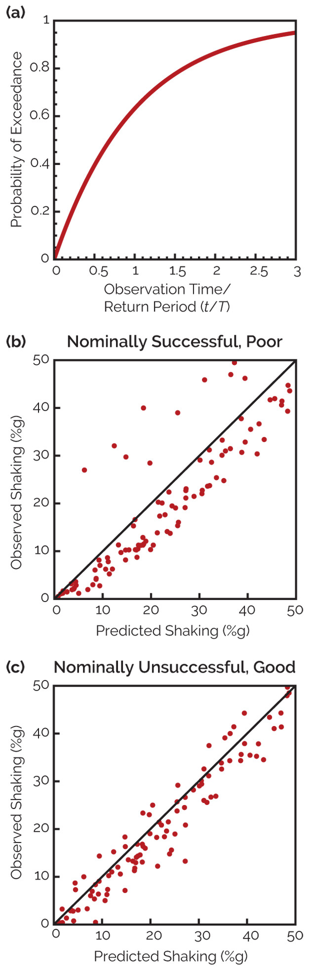
Figure 3: (a) The assumed probability (p) that during a t-year-long observation period, shaking at a site will exceed the value shown on a map with return period T. This probability depends on the ratio t/T. Thus if we consider a number of sites, a fraction p should have shaking higher than mapped. (b) and (c) Comparison of the results of two hazard maps. The plot in (b) is for a hazard map that is successful by the fractional site exceedance metric, but significantly underpredicts the shaking at many sites and overpredicts the shaking at others. The plot in (c) is for a hazard map that is nominally unsuccessful as measured by the fractional site exceedance metric, but better predicts the shaking at most sites. Credit: Stein et al., Bulletin of the Seismological Society of America, 2015.
To see how well a hazard map did, we take the sites on a map and plot each as a dot showing the shaking predicted by the map compared to the largest shaking that actually happened (as in figures 3b and 3c). The sites at which shaking exceeded the mapped value fall above the line, which represents points for which the observed and predicted shaking are equal.
The most direct way to assess how well a hazard map worked is to look at the difference between the actual and predicted fractions of sites where shaking was higher than the mapped value, which is called the fractional exceedance. If the fraction of sites where shaking was higher than the mapped value is close to the predicted fraction, the fractional exceedance metric is small, and the map did well by this metric.
The fractional exceedance metric measures how well a probabilistic map does what it’s supposed to do. However, this measure doesn’t consider the size of the differences between the observed and predicted shaking, which are also important. To understand this, consider two different hazard maps.
In figure 3b the predicted and observed fractions are both 10 percent, so the fractional exceedance metric is zero and the map is perfect by this metric. However, many points are far from the line, which is bad. Points far above the line indicate underpredicted shaking: If this map were used in building design, buildings in areas of underpredicted shaking might have experienced major damage. Points far below the line indicate overpredicted shaking: In these areas, structures might have been overdesigned, thus wasting resources. Viewed this way, the map did less well than we would like.
Figure 3c, on the other hand, represents a case where the predicted and observed fractions for exceedance are 10 percent and 20 percent, respectively, so by this metric the map didn’t do as well. However, most points are close to the line, so the maximum actual shaking in most locations was close to that predicted — which is good in terms of adequately informing infrastructure design to withstand the maximum shaking without being overdesigned. The shaking wasn’t substantially underpredicted or overpredicted, so in this sense the map did well.
Because the fractional exceedance metric doesn’t reflect the sizes of the differences between the observed and predicted shaking, we also use another measure of map performance called the squared misfit metric. This measures the difference between the predicted and observed shaking.
The takeaway is that each metric measures different aspects of a map’s performance. We could also use other metrics. For example, because underprediction potentially does more harm than overprediction — buildings could suffer major damage, potentially killing or injuring people — we could weight underprediction more heavily. Another option is to weight the misfits more heavily for areas with the largest exposure of people and property, such that the map is judged most on how it does in those places.
Although no single metric fully characterizes map behavior, using several metrics can give useful insight for comparing and improving hazard maps. For example, we can compare the performance of probabilistic hazard maps (which give a range of the expected earthquake size and expected shaking) with another class of maps, called deterministic hazard maps, which seek to specify the largest earthquake, and resulting shaking, that could realistically occur for each location.
The idea of using several metrics to measure hazard map performance makes sense. In general, assessing any system’s performance involves looking at multiple aspects. This concept is familiar in sports, where players are evaluated in different ways. For example, a baseball player may be an average hitter, but valuable to a team because he is an outstanding fielder, as measured by a metric called “wins above replacement” that measures both hitting and fielding. In many seasons, Babe Ruth led the league in both home runs and in the number of times he struck out. By one metric he did very well, and by another, very poorly.
Using these approaches, researchers are looking at different aspects of earthquake hazard maps, including validation. One of the challenges of determining how well a hazard map forecasts shaking is that the records of recent shaking are short and/or sparse for many locations. To get long-enough earthquake histories to accurately represent potential shaking in an area, researchers can use shaking records derived by combining historical accounts of shaking with past seismological data. Looking backward in time to validate maps — called “hindcasting” — isn’t exactly the same as a forecast of the future, but it is still useful.
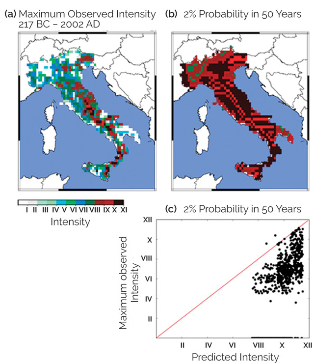
Figure 4: Comparison of (a) historical earthquake shaking intensity data for Italy to (b) a probabilistic hazard map with a return period of 2,500 years. The hazard map overpredicts the observed shaking, as also shown in (c). Credit: Stein et al., Bulletin of the Seismological Society of America, 2015.
Italy offers a good example of the utility of validating hazard maps. Figure 4 shows the maximum intensity of earthquake shaking throughout Italy from 217 B.C. to A.D. 2002. These levels of shaking are generally much lower than those predicted by the national hazard map produced by Italy’s National Institute of Geophysics and Volcanology with a return period of 2,500 years, which corresponds to a 2 percent probability in 50 years (50/0.02 = 2,500). The massive discrepancy could result from one or more problems: Some of the assumptions about the locations, timing and level of shaking in future earthquakes that went into the hazard map may have caused overpredictions. Alternatively, and seemingly more likely, much of the misfit may result from the historical catalog of seismicity in Italy having too-low values because of the limitations of the historical record — earthquakes may have been missed or the shaking intensities may have been underestimated from the historical accounts. These results show serious questions about the maps that need to be resolved.
Similar analyses for Japan (figure 5) also reveal problems. Based on the problems with the Japan hazard map, Robert Geller, of the University of Tokyo, suggested in a 2011 study in Nature that there is no good way to say that some parts of Japan are more dangerous than others. If this were true, hazard maps less detailed than present ones would be preferable because the additional detail would not be meaningful and could be misleading.
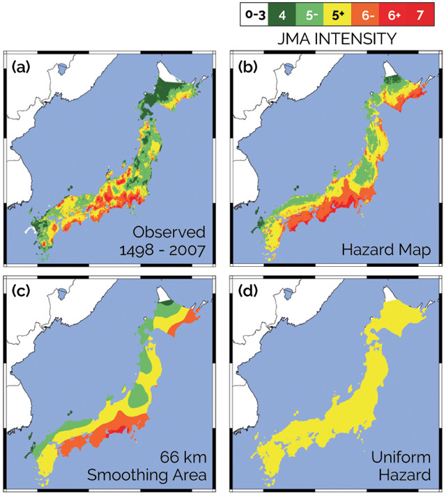
Figure 5: (a) Map of the largest-known shaking on the Japan Meteorological Agency intensity scale in 510 years. (b) Probabilistic seismic hazard map for Japan, generated for 475-year return periods. (c) Hazard map derived by smoothing (b) over 66-kilometer window. (d) Uniform hazard map derived by smoothing (b). Credit: (5a): Miyazawa and Mori, Bulletin of the Seismological Society of America, 2009; (5b, c, d): Brooks et al., Seismological Research Letters, 2016.
We tested this idea by comparing a 510-year-long record of earthquake shaking to both the Japanese national hazard map and a uniform map, in which the hazard is the same everywhere. Using the squared misfit metric, the national map does better than the uniform map. This is because the squared misfit metric depends mostly on how similar the predicted and observed shaking patterns are in space, which is what we see when we compare the two maps. However, as measured by the fractional exceedance metric, the uniform hazard map does better. This is because the national map somewhat overpredicts the observed shaking. As for Italy, it is unclear what causes these misfits.
A uniform hazard map amounts to starting with the national hazard map and averaging it over the whole country, so all spatial detail is lost and all places have the same hazard. An intermediate approach is to average, or smooth, the hazard map over different areas, which removes some but not all detail. For Japan, we find that, as measured by the squared misfit metric, an intermediate amount of smoothing works best. Map performance improves when we smooth over distances of up to about 100 kilometers; it then drops off with smoothing over larger areas. This result suggests that the national hazard map may be too detailed.
Other studies involve verification — how well should the hazard mapping method work? To explore this, we assume an ideal case for an area about the size of Belgium in which we know how often earthquakes will happen on average, how big they will be, and what shaking they will produce. We do two things: First, we generate an earthquake hazard map. Then, we generate a large number of simulated earthquake shaking histories in which earthquakes and shaking occur at random but in accordance with what we know about past earthquake behavior, calculate the largest shaking that occurred over time at each place on the map, and compare these to the hazard map.
Figure 6: (a) Uniform hazard map for an imaginary area. (b) Map of largest shaking that occurs during 50 years of simulated earthquakes. Some places experience greater shaking than shown by the hazard map, and others experience less shaking. Credit: Vanneste et al., AGU presentation, 2016.
For this ideal case, the hazard is uniform, so the hazard map is the same color everywhere (figure 6a). After 50 years of earthquakes, the map of the largest shaking varies from place to place. As shown for one synthetic history, some places (in orange to red) experience greater shaking than shown on the map, while other places (in white to green) experience shaking lower than shown on the map. This matches our real-life experience that when large earthquakes happen, maximum shaking is often higher than shown on hazard maps. The simulation shows that this can happen purely by chance and occurs in about as many places as the probabilistic method would predict. In 50 years, about 10 percent of the sites should have shaking higher than predicted by a map with a 475-year return period. Thus, in this example, the probabilistic method is working as expected.
Such simulations point out an interesting problem. When we observe shaking greater than predicted by a hazard map, it is hard to tell whether the misfit is due to a problem with the map, or whether it occurred just by chance, as in the example shown. The longer the period of observations we have, the better our chances of distinguishing between a bad map and bad luck.
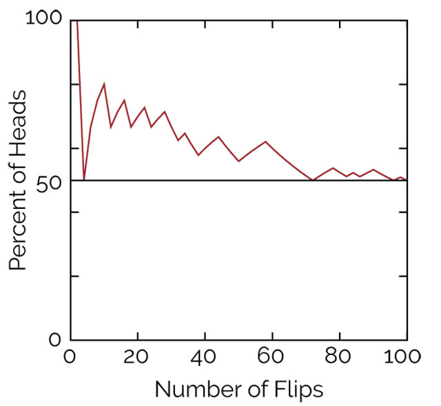
Figure 7: A simple coin flipping experiment in which data initially don't match the expectation that half of the flips should yield heads. Early on, after just 10 flips, seven of the flips were heads, so it appears that reality is not in agreement with expectation; with more flips, reality aligns more closely with expectation. Until we have data from many flips, it's hard to tell whether the model of a fair coin is wrong, or the misfit is just bad luck. Credit: Seth Stein.
To see how this works, imagine trying to decide if a coin is fair — equally likely to come up heads or tails when it is flipped. If the coin is fair, then in the long run, 50 percent of the flips will give heads. However, that’s often not true in the short run. In the illustrated example (figure 7), many more heads than tails occur until the coin has been flipped about 70 times. Based on a smaller number of flips, we can’t tell whether we’re getting an excess of heads because the coin is biased — which would be like having a bad hazard map — or if it’s simply due to chance.
Seismologists are exploring difficult questions in trying to understand and improve how earthquake hazard maps work, and our understanding is growing. There’s a long way to go, but it looks as if we’re on the right track: We’re developing better methods to assess how these maps should work and how they actually do work.
At the same time, it’s worth remembering that forecasting the future is always challenging. Studies have shown that experts are often no better than dart-throwing monkeys at predicting human events like sports winners, elections, wars, economic collapses and other events. Forecasting the behavior of natural systems is also tough. The meteorological community, in whose footsteps seismologists are following, recognizes this. For example, the National Weather Service’s Climate Prediction Center cautions “potential users of this predictive information that they can expect only modest skill.”
Given how complicated earthquakes are, and the limitations of our knowledge about them, seismologists should do their best to improve hazard maps and to understand the maps’ uncertainties while accepting and admitting that there are limits to how well we can do.
© 2008-2021. All rights reserved. Any copying, redistribution or retransmission of any of the contents of this service without the expressed written permission of the American Geosciences Institute is expressly prohibited. Click here for all copyright requests.